CSS Grid Challenge: Portfolio Layout
Objective:
This exercise challenges students to create a portfolio layout using CSS Grid. The layout will showcase multiple project cards, each containing a title, description, and thumbnail image.
HTML Structure:
CSS Challenge:
- Style the portfolio section: Apply styles to the
.portfolioclass using CSS Grid properties. You’ll need to define the grid layout with rows and columns to accommodate multiple project cards. - Position the project cards: Style the
.project-cardelements to fit within individual grid cells. - Layout the project content: Use CSS Grid to arrange the
<h2>,<p>, and<img>elements within each project card.
Hints:
- Consider using
grid-template-columnsandgrid-template-rowsto define the grid structure. - Explore properties like
grid-gapto add spacing between cards. - Use
grid-columnandgrid-rowto position project cards and their content within the grid.
So DO NOT forget to..
- Define Grid Layout: Use CSS Grid properties to define the number of columns and rows for the project cards in the
.portfoliosection. Consider how many cards you want to display per row on larger screens. - Style Project Cards: Students might need to adjust styles for the project cards (including width and height) to fit the chosen grid layout.
- Content Arrangement: They can experiment with
grid-columnandgrid-rowproperties to position the project title, description, and image within each card, ensuring a visually appealing layout.
Here is a solution file. Please DO NOT OPEN if you haven’t tried to solve it yourself first!!!
Challenge 2
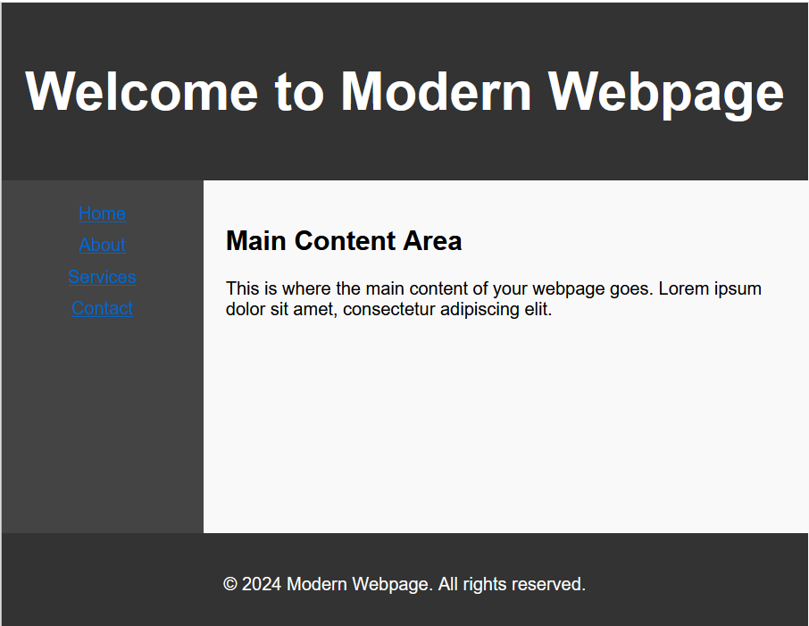
Replicate a Modern Webpage Layout
Objective: The objective of this exercise is to replicate the layout of a modern webpage using HTML and CSS. By completing this exercise, you will practice your skills in structuring webpages and using CSS for layout design.
Instructions:
- Study the provided image of the modern webpage layout.
- Use HTML to structure the webpage, including elements such as header, navigation bar, main content area, and footer.
- Use CSS to style the webpage and create the layout as closely as possible to the provided image.
- Pay attention to details such as font sizes, colors, padding, and alignment to achieve a polished look.
- Ensure that the webpage is responsive and looks good on different screen sizes.
This is a solution file. Please DO NOT open if first you haven’t solve this yourself!!